

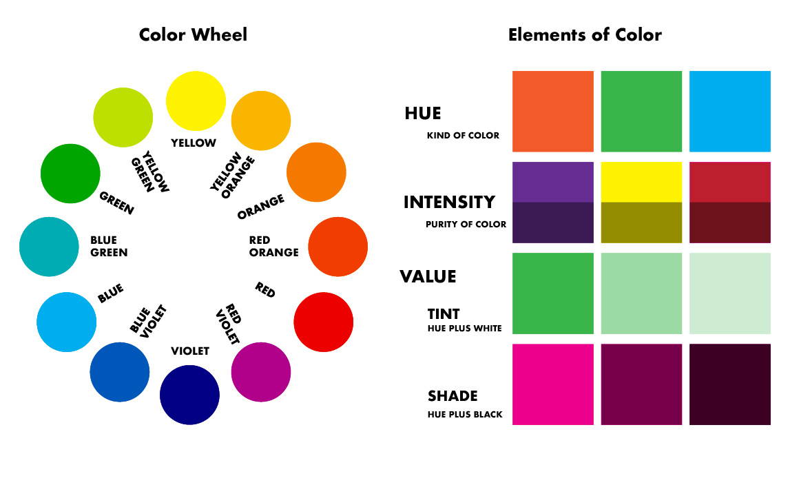
Color theory guide resources can completely transform the way you see and use color. Whether you’re painting a canvas, designing a website, decorating a room, or choosing brand colors, understanding how colors interact changes everything.
I remember the first time I truly understood color harmony. I had painted what I thought was a beautiful landscape, yet something felt off. The proportions were correct, the shading looked fine, but the colors clashed. After studying the fundamentals of color relationships, everything clicked. My next painting felt balanced and alive.
That’s the power of knowledge. When you understand why certain combinations work and others don’t, creativity becomes intentional rather than accidental.
Why Every Artist Needs a Color Theory Guide
Color isn’t just decoration. It communicates emotion, movement, and meaning. A strong Color theory guide explains how hues interact, how contrast creates drama, and how harmony builds visual comfort.
Historically, artists have studied color deeply. One of the most influential contributors was Johannes Itten, who developed structured color systems while teaching at the Bauhaus. His work shaped modern color education.
When artists ignore color principles, their work can feel unbalanced. When they apply them intentionally, even simple compositions feel powerful.
Understanding color is not about memorizing rules. It’s about recognizing patterns and relationships that enhance visual storytelling.
The Foundations Explained in This Color Theory Guide
At its core, color theory begins with the color wheel. Primary colors form the base. Secondary colors are created by mixing primaries. Tertiary colors result from blending primary and secondary hues.
This structured arrangement makes it easier to understand relationships. Complementary colors sit opposite each other on the wheel. When paired, they create strong contrast.
Analogous colors sit beside each other. They create harmony and flow. Triadic schemes use three evenly spaced colors for balanced vibrancy.
A comprehensive Color theory guide helps you visualize these relationships clearly, making color selection less intimidating.
Warm vs. Cool Colors and Emotional Impact
Colors carry emotional weight. Warm tones like red, orange, and yellow often feel energetic and inviting. Cool tones such as blue, green, and violet feel calm and soothing.
Psychological studies suggest that color influences mood and perception. Hospitals often use soft blues and greens to promote relaxation. Fast-food brands frequently rely on reds and yellows to stimulate appetite.
A practical Color theory guide explores these psychological effects in detail. When you understand emotional associations, your creative decisions become more purposeful.
For example, painting a winter landscape with warm undertones subtly shifts its emotional impact. The viewer may feel comfort instead of cold isolation.
How Light Changes Color Perception
One of the most overlooked aspects in any Color theory guide is lighting. Colors rarely look the same under different light sources.
Natural daylight reveals hues more accurately. Artificial lighting can shift tones dramatically. A cream wall may appear yellow under warm bulbs and almost gray under cool LEDs.
Professional painters and interior designers test color samples at different times of day. Observing how light alters appearance prevents costly mistakes.
Artists also consider reflected light. Shadows are rarely pure black. They often contain subtle hints of surrounding colors. Recognizing this detail elevates realism in artwork.
Color Harmony and Balance
Color harmony refers to visually pleasing combinations. Achieving harmony requires understanding proportion and dominance.
A balanced palette usually includes a dominant color, a secondary supporting color, and an accent. Too many competing hues create chaos.
A strong Color theory guide emphasizes restraint. Sometimes limiting your palette enhances impact more than using every color available.
Impressionist painter Claude Monet mastered this approach. His water lily series demonstrates how subtle variations within a limited palette can create depth and tranquility.
Harmony does not mean boring. It means intentional coordination.
Applying Color Theory in Digital Design
Modern creatives often work digitally. Graphic designers, web developers, and social media creators rely heavily on color decisions.
A detailed Color theory guide helps designers create accessible interfaces. Contrast between text and background improves readability. Complementary accents guide user attention.
Branding also depends on color psychology. Companies carefully choose hues that reflect personality. Blue often signals trust. Green suggests growth or sustainability.
Digital tools now provide color palette generators. However, without understanding underlying principles, these tools can produce inconsistent results.
Learning color fundamentals empowers designers to move beyond templates and create cohesive visual identities.
Practical Exercises to Strengthen Your Understanding
Knowledge becomes powerful when applied. One effective way to internalize lessons from a Color theory guide is through experimentation.
Try painting the same subject using different color schemes. Create one version with complementary contrasts and another with analogous harmony.
Notice how mood changes instantly. Even subtle adjustments can alter emotional tone.
Another helpful exercise is studying master paintings. Analyze how artists distribute warm and cool areas. Observe how focal points are emphasized through contrast.
These practical experiences deepen understanding far more than theory alone.
Common Mistakes Beginners Make
Many beginners believe brighter automatically means better. Over-saturation often overwhelms viewers.
Another mistake is ignoring undertones. Mixing colors without awareness can create muddy results.
A thorough Color theory guide teaches careful blending and layering. Small adjustments in hue or value dramatically improve clarity.
Beginners also struggle with value contrast. Even the most vibrant palette fails if light and dark areas lack balance.
Learning to see value independently of color strengthens composition significantly.
Cultural Influences on Color Meaning
Color symbolism varies across cultures. In Western contexts, white often symbolizes purity. In some Eastern traditions, it represents mourning.
Red can symbolize luck and celebration in parts of Asia, while suggesting warning or danger elsewhere.
A global Color theory guide acknowledges these variations. Designers working internationally must consider cultural context carefully.
Understanding symbolic meaning ensures respectful and effective communication.
Advanced Color Techniques
As skills grow, artists experiment with advanced techniques such as color glazing and optical mixing.
Glazing involves layering transparent colors to create luminous depth. Optical mixing occurs when small strokes of different colors blend visually from a distance.
Post-Impressionist painter Georges Seurat used pointillism to apply optical mixing scientifically.
A deeper Color theory guide explores how these advanced strategies create vibrancy and realism.
Experimentation builds confidence. Once foundational principles feel natural, pushing boundaries becomes exciting rather than intimidating.
Integrating Color Theory into Everyday Creativity
Color theory is not limited to fine art. It influences fashion, photography, interior design, and marketing.
Choosing outfits based on complementary tones creates visual cohesion. Decorating a room with analogous hues fosters calm.
Even social media posts benefit from thoughtful palettes. Consistent color schemes strengthen brand recognition.
Applying lessons from a Color theory guide to daily life sharpens aesthetic awareness.
You begin noticing color relationships everywhere, from sunsets to storefront displays.
Developing a Personal Color Style
Every artist eventually develops a unique palette preference. Some gravitate toward earthy neutrals. Others favor bold contrasts.
Studying a reliable Color theory guide helps you understand why certain palettes resonate with you.
Keeping a color journal can clarify patterns. Save swatches, photograph inspiring scenes, and document combinations that feel harmonious.
Over time, your personal style becomes recognizable. Instead of copying trends, you create consistent visual language.
That consistency builds artistic identity and confidence.
Teaching and Sharing Color Knowledge
Artists who truly understand color often enjoy teaching it. Explaining principles reinforces mastery.
Workshops, online tutorials, or simple conversations with fellow creatives deepen collective understanding.
When sharing lessons from a Color theory guide, clarity matters. Use relatable examples rather than technical jargon.
Mentorship accelerates growth for both teacher and student. Discussing successes and mistakes openly builds credibility and trust.
Read also: